library(readr)
library(tidyverse)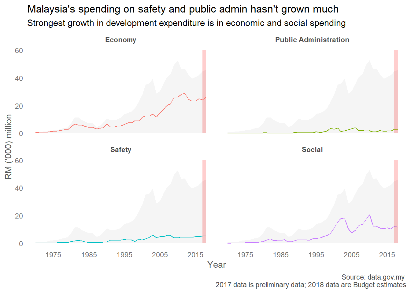
library(here)I thought I’d practice my rusty R skills when I came across a post by Khairil Yusof on the Sinar Project Facebook group that Malaysian Administrative Modernisation and Management Planning Unit (MAMPU) has made data on development expenditure over time available on data.gov.my. I haven’t paid close enough attention to government budgets to have much comments about the trends, but a comment can be found here. Tl;dr, the authors note that Malaysia’s stagnating development expenditure is concerning since Malaysia is a developing economy.
My thinking while constructing this plot was to contrast the growth in each category of expenditure against the overall growth in development expenditure over time. I’m thinking about also including the trend in each category of expenditure within each facet.
Data is obtained from data.gov.my. A cleaned version of the data is available here.
malaysiaDevExp <- read_csv(here("data", "malaysiaDevExp.csv"))Rows: 49 Columns: 19
── Column specification ────────────────────────────────────────────────────────
Delimiter: ","
dbl (19): Year, EconomyTotal, AgroRuralDev, PublicAmenities, TradeAndIndustr...
ℹ Use `spec()` to retrieve the full column specification for this data.
ℹ Specify the column types or set `show_col_types = FALSE` to quiet this message.# create separate dataframe for background totals
malaysiaDevExp %>%
select(Year, Value = Total) %>%
mutate(Year = as.numeric(Year),
Value = Value/1000)-> DevExpTotal
malaysiaDevExp %>%
# select some columns; rename as needed
select(Year,
Economy = EconomyTotal,
Social = SocialTotal,
Safety = SafetyTotal,
`Public Administration` = PublicAdmin) %>%
# Year was imported as factor; change this to numeric
mutate(Year = as.numeric(Year)) %>%
gather(ExpCat, Value, -Year) %>%
ggplot(aes(x = Year, y = Value/1000)) +
# totals in background
geom_ribbon(data = DevExpTotal,
aes(ymin=0, ymax = Value),
fill = 'gray96',
group = 1) +
# line representing each expenditure category, in different colors
geom_path(group=1, aes(color = ExpCat)) +
# separate each expenditure category into facets
facet_wrap(~ExpCat) +
# no legends
guides(color = FALSE) +
# set break points in x-axis
scale_x_continuous(breaks = c(1975, 1985, 1995, 2005,2015)) +
# draw rectangle to highlight that numbers should be treated with caution
geom_rect(inherit.aes=FALSE,
aes(xmin=2017, xmax=2018, ymin=0, ymax=60),
color="transparent",
fill="lightcoral",
alpha = 0.01) +
theme_minimal() +
theme(panel.grid.major = element_blank(), # remove grid lines
panel.grid.minor = element_blank(),
# bold facet titles
strip.text = element_text(face = 'bold', color = 'gray29'),
# format text on ticks
axis.text = element_text(size = 9, color = 'gray45'),
# format axis labels
axis.title = element_text(color = 'gray35'),
# format caption text
plot.caption = element_text(color = 'gray30')) +
labs(title = "Malaysia's spending on safety and public admin hasn't grown much",
subtitle = "Strongest growth in development expenditure is in economic and social spending",
y = "RM ('000) million",
caption = "Source: data.gov.my \n2017 data is preliminary data; 2018 data are Budget estimates")Warning: The `<scale>` argument of `guides()` cannot be `FALSE`. Use "none" instead as
of ggplot2 3.3.4.